

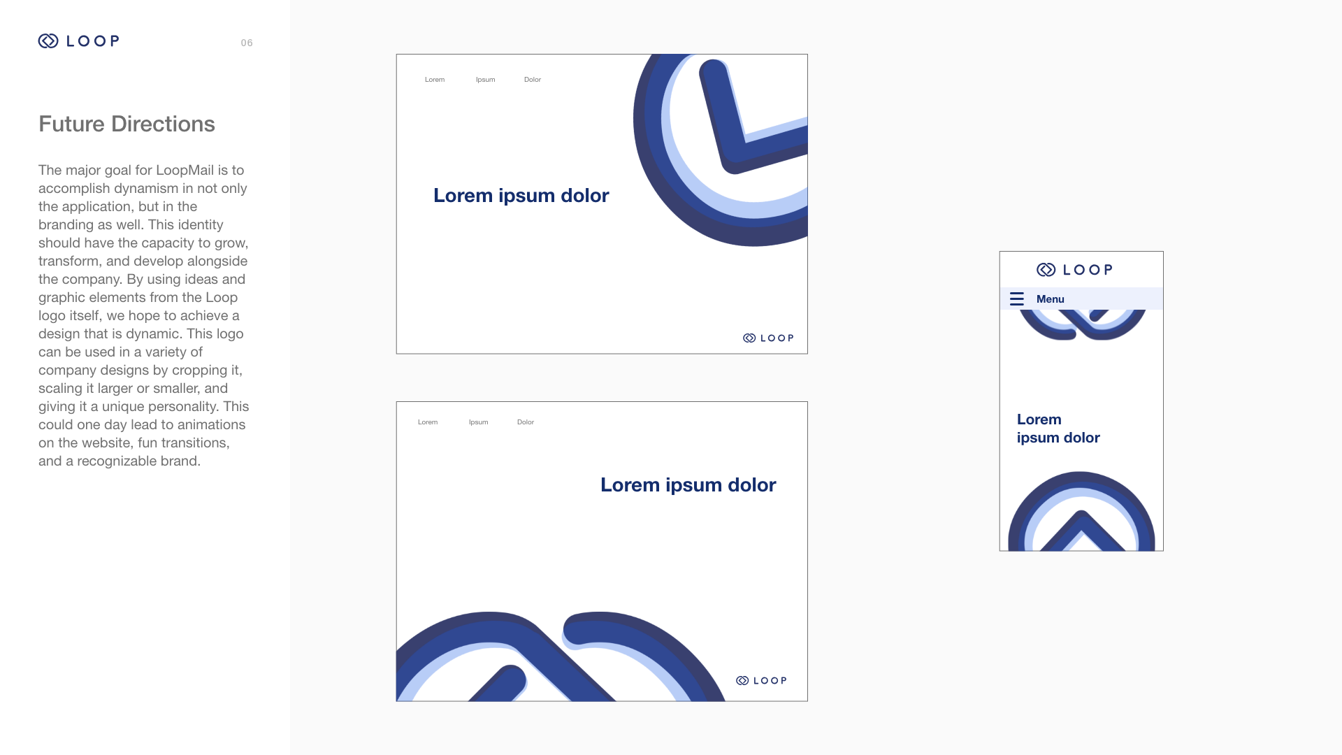


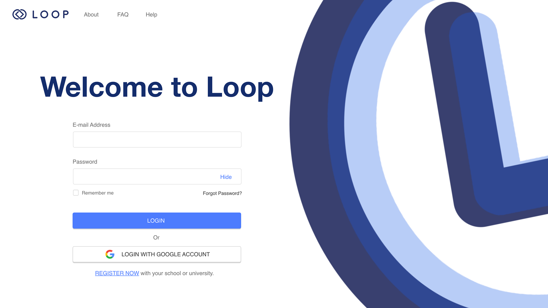
Welcome screen. This welcome screen incorporates the new Loop branding.
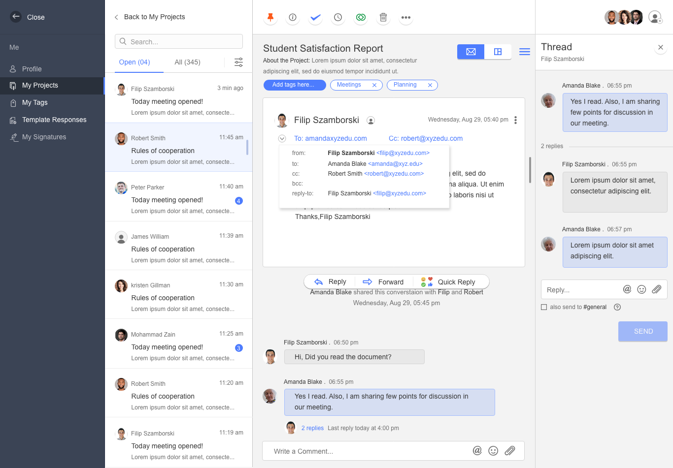
Email popover. This UX screen was developed using Adobe XD. This screen addressed the design and architecture of the email popover, which appears with more information when a user clicks the arrow next to the incoming email addresses. Before this redesign, the popover design was unclear - the popover did not stand out in a noticeable way, and it concealed important information. In this design, the focus was on placement, the fields that needed to be present, ease of use, and overall clarity in function. We added shadowing to highlight the popover and spent time working through the information architecture.
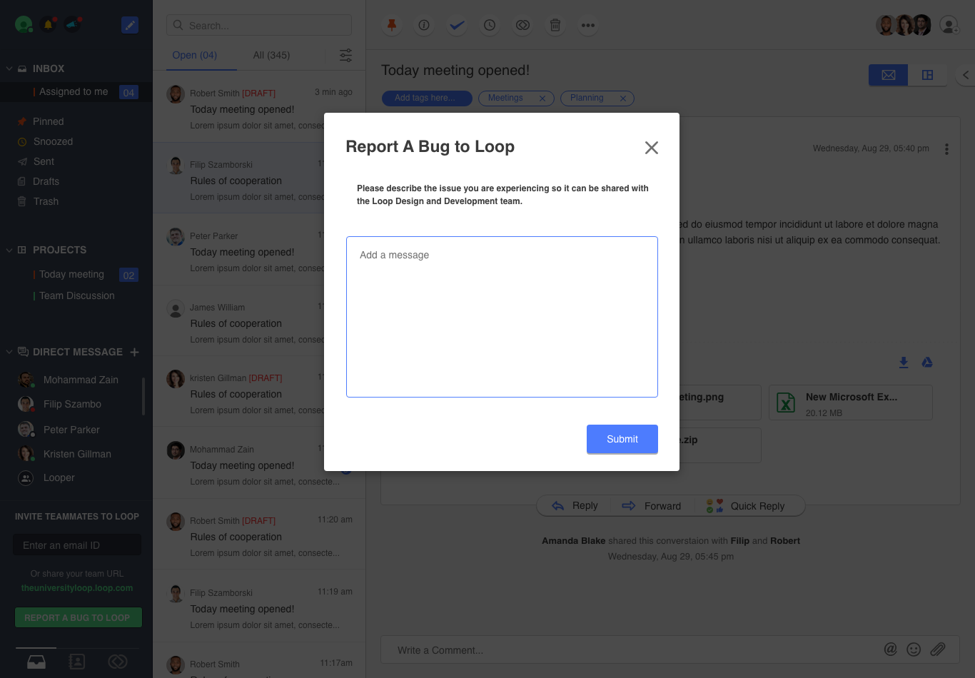
Report a bug. This screen was developed in collaboration with Cormac Rada. I worked on the clarity of the text in the "report bug" overlay, focusing mainly on the spacing, fonts, and sizing of elements. This screen is extremely important because it allows users to report things that are wrong with the application. Because these users may already be frustrated with the issue, it's imperative that this screen especially is both easy to navigate, beautiful, and clear.